
Meta Brand System
Meta approached us to help redefine their brand system with a top to bottom visual overhaul that could reflect their commitment to human-first experiences. The project involved developing a warm and rich new illustration system, expansive icon set, and data visualization approach—all built on a principled foundation of empathy, clarity, and authenticity.
brand system / iconography / data visualization / illustration
Produced by BUCK

Meta has a massive global audience and needed a clear and articulated approach to iconography that can transcend localization and semiotic ambiguity. We developed an icon system with human curves, rounded forms, and a friendly spirit inspired by the open, authentic Meta illustrations. The resulting set encompasses a vast library of icon forms that can flex to accommodate a wide variety of scenarios— from in-product wayfinding to marketing and sub branded offerings.
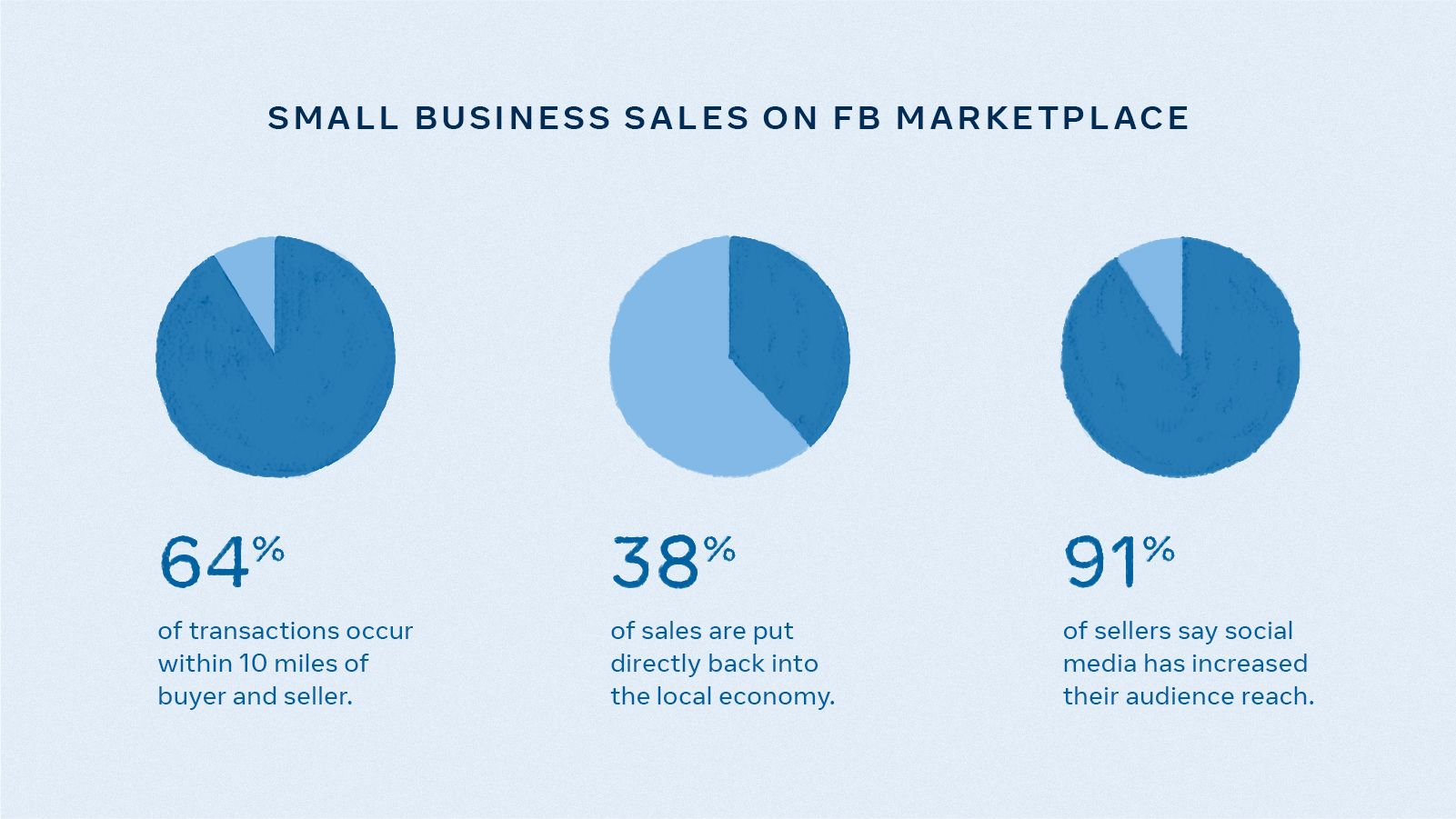
Meta’s data stories also needed to communicate a range of ideas from simple to complex in a way that is well understood by its audiences. We leveraged the essential clarity and human-first approach to illustration and iconography to inform data visualization, creating a two tiered system that is responsive to context.
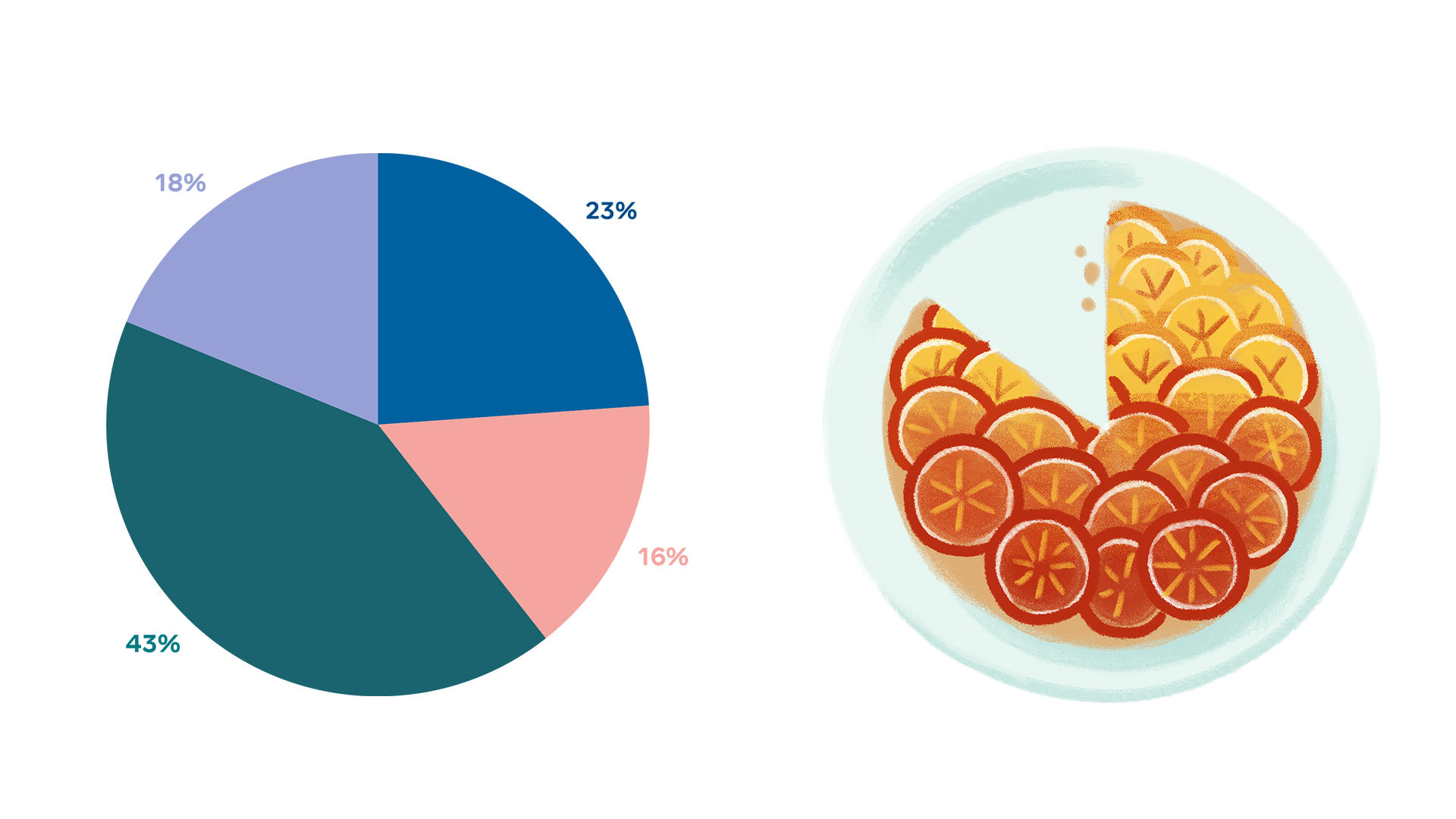
The substantive tier of visualization depicts data as we know it: hard working, clear, and rigorous. The expressive tier depicts data in a more narrative and bespoke manner to humanize the numbers and stories in between.